Coral Colours: An Expert's Guide to Mastering the Hue
Discover the warmth and versatility of coral: the vibrant hue between pink and orange. Expert guide to colour theory, perfect pairings, and sophisticated applications.
Quick Facts: Coral Colour
| Property | Details |
|---|---|
| Colour Family | Warm (Pink-Orange spectrum) |
| Primary Undertones | Pink, orange, peach |
| Hex Code | #FF7F50 |
| RGB Values | 255, 127, 80 |
| Best Pairings | Navy, teal, gold, cream, white |
| Psychological Effect | Warmth, vitality, friendliness |
| Popular Applications | Fashion, interiors, jewelry, branding |
Introduction
Coral is more than a name on a colour chart, it is a living gem born from the sunlit depths of the sea and admired since antiquity. This distinctive hue, poised between optimistic orange and delicate pink, carries a timeless energy that is both playfully chic and elegantly refined.
More than a simple style guide, this text offers an expert exploration of coral through the trained eye of a gemologist. It provides a deep understanding of the colour, its nuances, ideal pairings, and rich symbolism so you can master every shade with confidence, whether in a space or an ensemble.
The Essence of Coral: From Gemstone to Hue
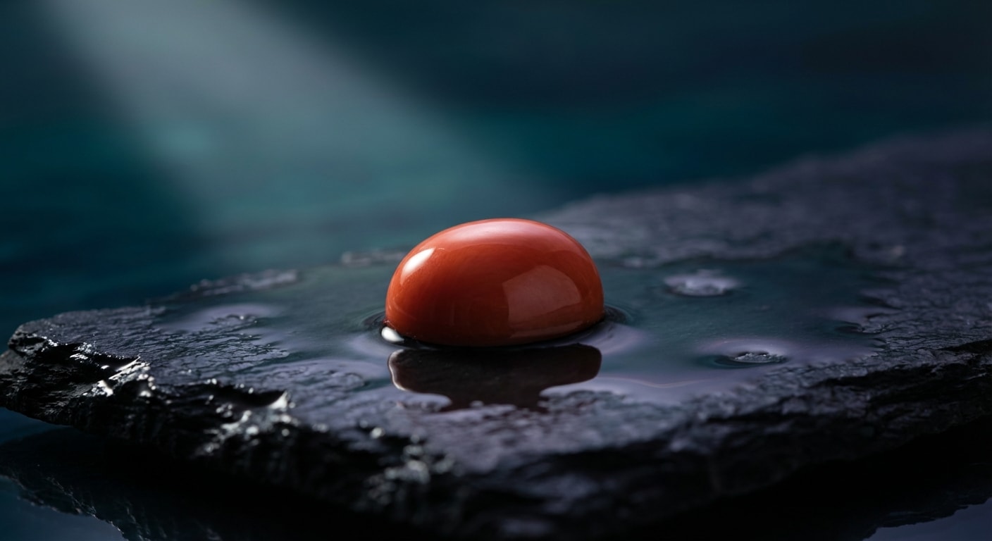
Before it was a designer’s accent or a swatch in a palette, the color coral was a treasure drawn from the depths of the ocean. Its story is not one of pigments and dyes, but of life, warmth, and the enduring allure of precious materials. To truly understand the hue, one must first appreciate its origin: the organic gem known as precious coral. This is the vital link that elevates coral from a simple colour to a narrative of timeless luxury.
More Than a Colour: The Natural Origin of Coral
Unlike mined gemstones like diamonds or sapphires, precious coral is a gift from the sea, formed over centuries by tiny marine polyps in sunlit waters. This natural genesis gives it a unique warmth and energy that has been prized for millennia. Ancient Romans draped their children in coral beads, believing it to ward off evil, while Victorian high society coveted intricately carved cameos and parures as symbols of wealth and exotic travel.
This rich heritage is infused into the colour itself. When we speak of the shades of coral, we are not merely describing a blend of orange and pink; we are channeling a history of adornment, protection, and natural artistry. It is a colour rooted in something tangible and rare, carrying the legacy of the gemstone from which it takes its name.
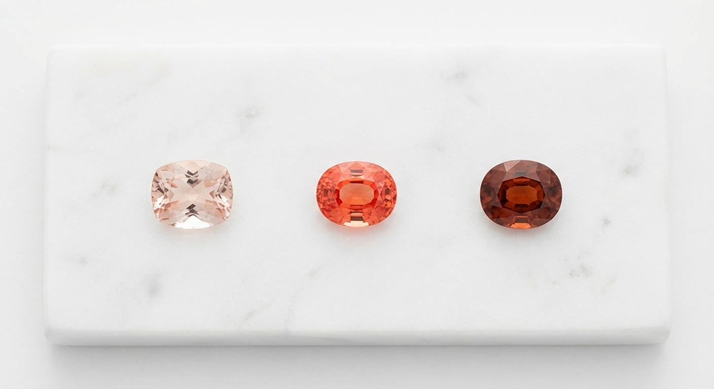
A Visual Guide to the Coral Spectrum
As gemologists, we understand that a single name rarely captures the full story of a colour. The world of coral is a breathtaking spectrum, with each variation possessing a distinct personality. By viewing these shades through the lens of other precious gems, we can better appreciate their nuanced beauty.
Peachy Pinks (Angel Skin Coral): At the most delicate end of the spectrum lies the soft, romantic blush of peachy coral. This ethereal coral pink colour is best embodied by the legendary and highly sought-after Angel Skin Coral. Its gentle, flattering warmth is akin to the tender glow of a Morganite gemstone, exuding a quiet and sophisticated grace. It is a colour of subtlety and romance.
Vibrant Oranges (Padparadscha Sapphire): This is coral at its most confident and energised. A brilliant, life-affirming orange with fiery pink undertones, this shade captures the exhilarating spirit of a tropical sunset. Its closest counterpart in the gem world is the exceedingly rare Padparadscha sapphire, a stone prized for its perfect marriage of pink and orange. This is a shade that commands attention and radiates joyful optimism.
Muted Terracottas (Sardinian Coral): Deeper and more soulful, terracotta coral possesses an earthy, grounded elegance. It evokes the rich, sun-baked clay of Mediterranean villas and the deep, desirable red of Sardinian coral. This shade is less about vibrant energy and more about sophisticated warmth and artisanal heritage. It’s a mature, worldly hue that feels both ancient and incredibly modern.
The Art of the Coral Colour Palette
Understanding the essence of coral is the first step; mastering its application is the art. The question of what colours go with coral is less about rigid rules and more about understanding the principles of harmony and contrast. As with combining rare gemstones in a piece of high jewelry, creating a successful coral colour palette is a delicate balance of science, intuition, and a discerning eye. The secret lies in leveraging colour theory to either soothe the senses or create a dynamic visual dialogue.
The Theory of Harmony: Why Certain Colours Pair Beautifully with Coral
Before we present curated palettes, it’s essential to understand why certain combinations are so effective. This knowledge empowers you to create your own schemes with confidence. The principles are timeless, drawn from the fundamental relationships on the colour wheel.
Complementary Contrast: The most dramatic and confident pairings often come from opposites. On the colour wheel, the cool blue-greens of turquoise and teal sit directly across from warm coral. When placed together, they intensify one another. The coolness of the teal makes the coral appear warmer and more vibrant, creating a powerful, energetic tension. This is a classic pairing seen in everything from Art Deco jewelry to coastal interior design.
Analogous Serenity: For a more subtle and sophisticated effect, look to coral’s neighbours. Pairing coral with adjacent hues like soft peach, dusty rose, and rich orange creates a seamless, harmonious blend. This analogous approach evokes a natural gradient, much like a sunset or the delicate colour zoning within a single Padparadscha sapphire. The result is a palette that feels cohesive, warm, and effortlessly elegant.
Triadic Balance: For a palette that is both balanced and visually rich, a triadic scheme is an expert choice. This involves selecting three colours that are evenly spaced on the colour wheel. For coral, this often means pairing it with shades of soft yellow and tranquil blue. This combination is dynamic without being overwhelming, offering a cheerful yet sophisticated energy.
5 Timeless Palettes Featuring Coral Colours
Armed with theory, we can explore curated schemes designed to inspire. Here are five timeless palettes that showcase coral’s incredible versatility, each creating a distinct and luxurious mood.
Coastal Serenity: The epitome of refined, nautical elegance. This coral colour scheme pairs a soft, sun-bleached coral with crisp white, deep coral and navy blue, and the grounding warmth of a sandy beige. It evokes the effortless luxury of a seaside villa in the Hamptons or the French Riviera.
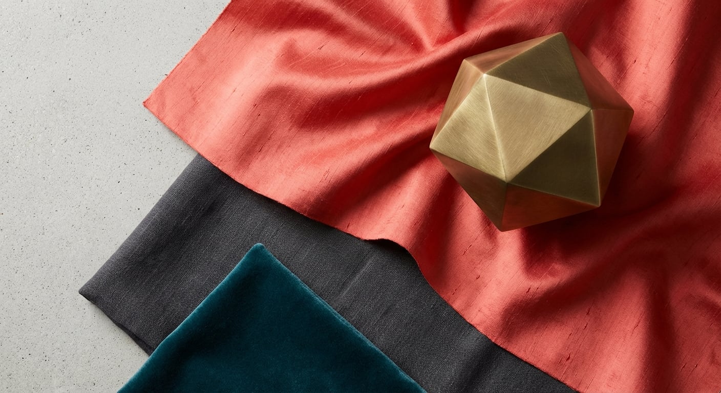
Modern Vibrance: Confident, architectural, and undeniably chic. Here, a vibrant pop of coral is set against the sophisticated backdrop of coral and grey, specifically a deep charcoal. Add an accent of rich teal and finish with the gleam of brushed brass or gold. This palette is perfect for a contemporary urban space or a bold fashion statement.
Earthy Warmth: A grounded and soulful palette inspired by the natural world. This scheme marries a muted, terracotta coral with creamy off-white, rich olive or forest green, and deeper shades of baked earth. It feels artisanal and organic, ideal for spaces that champion natural materials like linen, clay, and reclaimed wood.
Monochromatic Grace: A daring and artistic approach that showcases the full spectrum of coral itself. This palette layers shades from the palest peach and Angel Skin pink to a deep, intense reddish-orange. The effect is enveloping and dramatic, creating a powerful statement of warmth and sophisticated style.
Sunset Jewel: The most opulent and adventurous of our palettes. This scheme draws inspiration directly from a gemologist’s treasure box. It combines the fiery warmth
A Curated Guide to Using Coral Colours
With an understanding of coral’s spectrum and the art of palette creation, we move from theory to tangible elegance. Applying coral is about strategic placement and intentionality, whether you are crafting a memorable coral outfit or designing an inviting living space. It is a colour that can whisper in a subtle accent or command a room as a bold statement. The key is to wield its warmth with the precision of a master jeweller setting a precious stone.
Coral in Fashion & Style: From Accent to Statement
In personal style, coral is a declaration of confidence and warmth. It is exceptionally flattering to a wide range of skin tones, imparting a healthy, sun-kissed glow. Its versatility allows it to be incorporated with varying degrees of intensity.
The Strategic Accent: For those new to the hue, a single coral piece can instantly elevate a neutral ensemble. Consider a structured leather handbag in a vibrant coral against a navy suit, or a fine silk scarf that brings life to a simple cream dress. For the true connoisseur, however, the most refined accent is a piece of fine jewelry. A polished coral cabochon in a cocktail ring or a delicate pendant resting on the collarbone serves as a personal, potent touch of colour.
The Power Piece: To make a definitive statement, embrace a signature garment. An impeccably tailored blazer in a sharp, orangey-coral projects modern confidence, while a fluid dress in a softer, peachy shade exudes effortless grace. When wearing a full coral fashion piece, the secret is to keep accompanying elements simple and luxurious, allowing the colour to remain the undisputed focal point.
The Art of Pairing with Jewelry: The metals and gemstones you choose can fundamentally alter the mood of a coral piece. Yellow gold harmonises with coral's inherent warmth, creating a rich, opulent glow reminiscent of a Mediterranean sunset. Conversely, platinum or white gold provides a crisp, modern contrast that makes the colour pop with startling clarity. For gemstone pairings, the classic combination of coral and turquoise is a timeless ode to the sea, while brilliant-cut diamonds add a touch of icy fire that amplifies the coral’s vibrant warmth.
Coral in Luxury Interior Design
Many shy away from using coral in interiors, fearing it may be overwhelming or trend-driven. However, when applied with sophistication, coral decor creates spaces that are warm, inviting, and deeply chic. The secret is balance and texture.
The 60-30-10 Rule: To avoid saturation, employ this classic designer principle. Use a dominant neutral (like a soft grey or cream) for 60% of the room, a secondary colour (like a deep navy) for 30%, and reserve coral for the final 10% accent. Think of coral as the "jewel" of the room—a pair of velvet cushions, a single statement armchair, a collection of Murano glass on a mantelpiece, or the vibrant art on the wall. This measured approach ensures the coral in a living room feels intentional and luxurious, not impulsive.
Feature Walls & Luxurious Textures: For a bolder application, consider a feature wall, but choose the right finish. A textured wallpaper, such as a grasscloth or silk, gives the colour depth and prevents it from feeling flat. The material itself transforms the colour: a coral velvet absorbs light for a sumptuous, moody effect, while a raw silk shimmers and changes with the light, adding dynamism and life.
Iconic Paint Colours: To ground your choice in
Adorning Your Life with Coral: Timeless Applications
Understanding coral’s nature and its perfect pairings is the foundation; applying it with elegance is the art. This vibrant hue is not meant to be reserved for the boldest among us. When wielded with intention, coral can infuse your personal style and living spaces with a warmth and sophistication that is both captivating and enduring. From a subtle whisper of colour to a confident statement, coral offers a spectrum of possibilities for a well-adorned life.
Coral in Your Wardrobe: A Statement of Personal Style
In the world of coral fashion, a little goes a long way. For those new to its charm, the key is to begin with accents. A fine silk scarf in a soft coral pink, a structured handbag in a rich coral orange, or a single, magnificent piece of coral jewelry can instantly elevate a neutral outfit. For a more immersive experience, a coral dress or blazer becomes a declaration of confidence and vitality. This colour is a perennial favourite for celebratory events, with coral bridesmaid dresses bringing a joyful, photogenic warmth to any wedding palette.
To select the most flattering shade, consider your skin’s undertones:
Warm Undertones: If your skin has golden or olive hues, you will radiate in orange-based corals. Think of vibrant salmon, rich terracotta, and sun-drenched apricot shades.
Cool Undertones: For skin with pink or blueish undertones, the cooler, pink-based corals are exquisite. Look for shades of coral blush, rosy pinks, and grapefruit tones.
Elegant Interiors: Using Coral with Intention
Bringing coral into your home is about creating an atmosphere of warmth and welcome. While coral paint colours can be stunning on an accent wall, the most luxurious applications often involve texture and form. Imagine the tactile pleasure of velvet coral cushions on a charcoal sofa, the comforting embrace of a cashmere throw in a dusty coral hue, or a single statement armchair that serves as the artistic heart of a coral living room.
In smaller or darker rooms, avoid saturation. Instead, use coral as a strategic focal point. A piece of abstract art with flashes of coral, a cluster of coral-toned vases, or patterned drapery can draw the eye and inject life into the space without overwhelming it. In a coral bedroom, softer, muted shades create a nurturing sanctuary that feels both calming and uplifting—the perfect environment to begin and end your day.
Beyond the Trend: Proving Coral's Timelessness
A common question we hear is, "is coral a trendy color?" While it may surge in popularity, its roots run far too deep to be considered a fleeting fad. Coral is a certified classic, a colour that has asserted its relevance across design history. Look to the glamorous zenith of the Art Deco colours palette, where coral was masterfully paired with lacquered black, polished chrome, and deep teal to create bold, geometric statements of modernity and luxury. Decades later, it was a darling of 1950s Parisian haute couture, used by designers like Dior to express a newfound post-war optimism and feminine power. Coral endures because its connection to nature, warmth, and vitality is a timeless human desire. It is not merely a trend; it is a recurring classic.
Frequently Asked Questions
Conclusion
Conclusion
Our journey has taken us from the sunlit depths of the ocean to the heights of sophisticated design, revealing coral not merely as a hue, but as a narrative of natural luxury. You now possess a gemologist’s understanding of the coral colours spectrum, armed with the knowledge to move beyond trends and embrace a timeless expression of warmth and vitality. With this guide, you have the confidence to wield its energy flawlessly, transforming your style and spaces with intention and grace.
To crystallize your newfound expertise, remember these key principles:
Understand the Origin: True mastery of coral begins with appreciating its source—the precious organic gem that lends it a unique history and warmth, elevating it from a simple colour to a story.
Pair with Intention: Move beyond simple matching by using colour theory. Create harmony with analogous shades like pink, or build dynamic contrast with complementary teals and navies for a look that is both balanced and bold.
Apply with Sophistication: Whether in fashion or interiors, use coral as a powerful accent. Adhere to the 60-3